
12 januari 2015, door Bart-Jan van Putten en Carrie Peterson
Dit artikel is momenteel alleen beschikbaar in het Engels.
Rather than letting seniors learn to use your system through trial-and-error, you should incorporate the principles of errorless learning. This will help seniors with cognitive impairments to use your system with more confidence and higher success rates.
Introduction
Have you wondered how your users learn to interact with your system? Have you considered why some features are more easily adopted than others? Do you want to make it easier for your users to use all the features of your system?
When a person uses an interactive system, (s)he is continuously learning which features the systems offers and how those can be used. Users, and especially younger users, often use a ‘trial and error’ approach to discover those features. Think about it, when was the last time you read a user manual?
Users over the age of 60 may have less confidence to make errors, and are less likely to start playing with a new system to explore how it works. Therefore, they often have more difficulty to learn to use it.
In this article, we describe errorless learning. If you incorporate errorless learning in your designs, seniors will be able to learn how to use your system, without making numerous errors. We will use websites as examples, but our theory also holds for physical interactive systems, such as microwaves, ticket vending machines, blood pressure meters, etc.
Trial and Error Learning
Learning by trial and error is a productive way to learn from our mistakes and creative play. Making mistakes usually helps information to stick in both short- and long-term memory as the learner makes an attempt and uses the feedback in the learning process. Trial and error can be an effective way to learn, but only if the user has no cognitive impairments in the ability to reason, make and follow strategy, and later recall the correct process.
The learning process is also influenced by the emotional responses to failure and frustration. When people with a learning disability or cognitive impairment use trial and error learning, they are more likely to recall the mistakes they have made rather than the successful actions, especially if these are tied to a strong (negative) emotional response. In these cases, errorless learning may be more effective for them to learn how to use your interactive system.
Errorless Learning
Errorless learning uses a set of methods to ensure that the user, or learner, can find the fastest route from intention to successful action. The goal is to reduce mistakes which can distract from the task at hand and reduce the amount of information that is learned.
Research has shown that errorless learning is even effective in people with dementia, both in the lab and in the home (de Werd, Boelen, Olde Rikkert, & Kessels, 2013).
What is an Error?
In order to be able to design systems that enable errorless learning, we first need to better understand what an error is. Examples of errors are:
- Clicking on the wrong link or button
- Entering incorrect or disallowed information in a form
- Not being able to complete a task
- Completing a task but with undesired results
Some errors are more severe than others. Clicking on a wrong link generally doesn’t cause much harm, unless the click leads to an undesired purchase. However, for example, not being able to buy a train ticket from a vending machine can be a problem and buying the wrong ticket even more so.
Which Things Cause Errors?
- Things you need to decide – the more options you provide, the higher the chance that an incorrect option is selected.
- Things that are ambiguous – these are options which look so similar that the incorrect one is chosen.
- Things you need to memorize – you might memorize them incorrectly or simply forget them altogether.
- Things of which there are too many – especially in forms with many fields, it is easy to overlook an item.
- Things which take too long – the longer a process takes, the higher the chance that one will lose concentration or start to forget things.
- Things that are too complicated – if your users do not understand what is expected from them, they will not be able to make the right decision.
Facilitating Errorless Learning with Your System
We have identified eight interaction design guidelines which will be particularly helpful if you want to facilitate errorless learning with your system.
1. Simplify Forms
Filling in forms can offer many opportunities for making mistakes, so these should be simplified.
- Reduce the number of fields. If a field is not required, carefully consider if it should be there at all. If you require both an email address and a username, consider if you can do with just the email address. However, if you require a first name and a last name, use separate input fields for those.
- Clearly mark required fields. This way, user will not skip a required field at first. If the form is very short and all fields are required, you do not need to mark them.
- Clearly state the required input format, e.g. “minimum eight characters.”
- Do not place the field’s label or formatting instructions inside the field. As soon as the user starts typing, these instructions will disappear, which means that the user needs to be able to remember them. Instead, put the formatting requirements next to the field, e.g. “mm-dd-yyyy.”
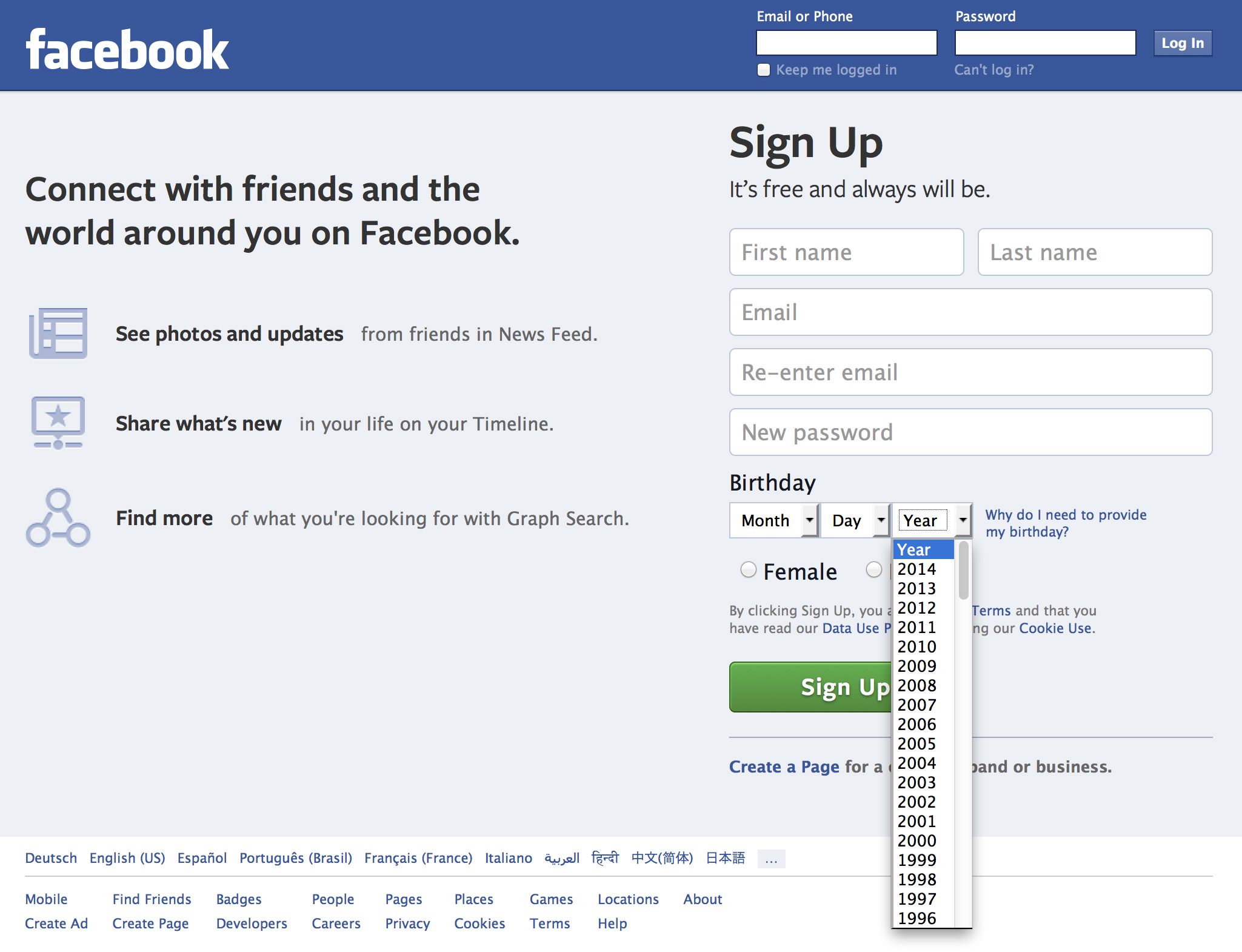
- Use radio buttons and dropdowns with pre-defined values for things such as gender, birthdays, country and country codes. Although the user could still enter an incorrect value, she cannot enter a value with an incorrect format.
- Use a ‘re-type password’ field. Some users make typos, especially in password fields where they only see bullets, rather than what they were actually typing. A second password field will allow your system to re-check the input. Because users could make exactly the same typo twice, your system should always provide the option to recover or reset a ‘lost’ password.
- Immediately validate the user’s input and provide feedback as close as possible to the input. This way, the user will immediately see what they should change and where. If you only provide feedback later, the user will need to re-find the respective input field and recall their past actions. This is never nice, but particularly hard for people with short-term memory impairments.
- Be forgiving. Whenever you can, convert the user’s input to something that your system can process, rather than bothering the user with error messages, e.g. spaces at the beginning or end of an input string can easily be trimmed off. When processing a phone number, your system should know how to deal with spaces, brackets, the plus-sign and the minus-sign.

2. Group and Hide Infrequently Used Options
Even within one screen, there can be too many options to choose from in one screen. Many of those options are never used by infrequent or inexperienced users. You should move those options to another screen, e.g. after clicking on a button ‘Advanced’ or ‘More options.’ You can also move the options to the bottom of the screen if the content is scrollable, such as on a website or mobile app.

3. Explain the Consequence of Each Option
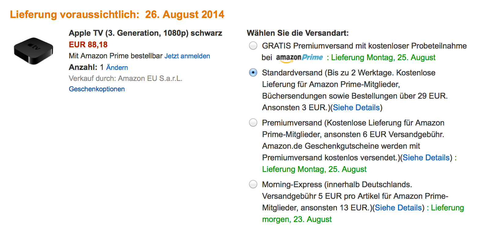
Whenever there might be doubt about the consequence of a decision, this should be explained. For example, when choosing between ‘pay by credit card’ and ‘bank transfer,’ it should be clear that in the latter case, the product will only be mailed out after the payment has been processed, which often takes a few days, while a credit card payment is immediate.


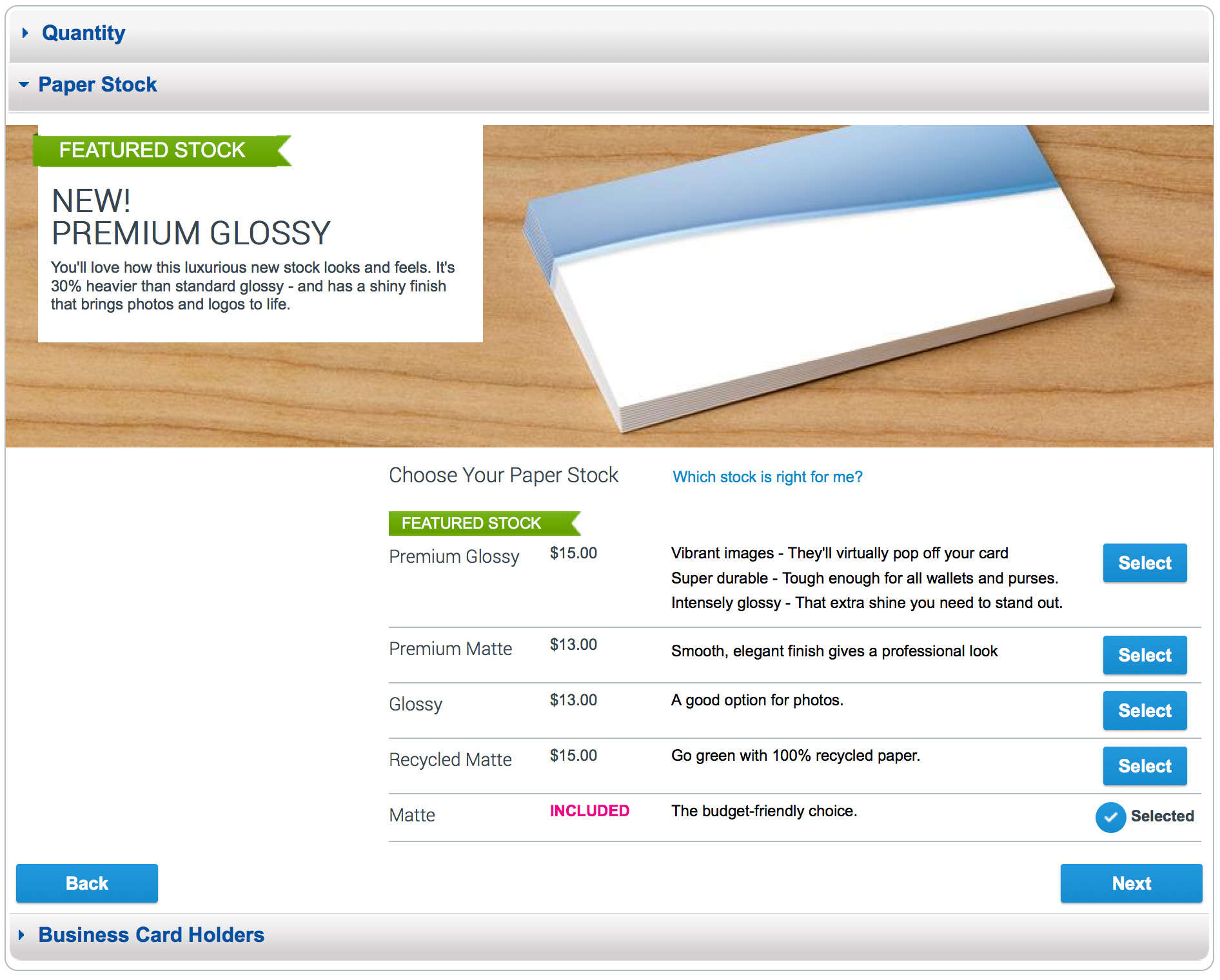
4. Mark the Default Option
If there is a mandatory choice that needs to be made, you should mark the default option. This way, when the user does not know what to select, a choice has already been made. Moreover, it saves most users time, because she only needs to confirm that the right option was selected, rather than reasoning about the best option.
The selected option can be the option that you would like your user to choose, or the option which is most popular among other users. Keep in mind that your users may overlook the decision point altogether and they would not be happy if you sold them something which they do not want to have in this manner.

5. Guide Long or Complex Tasks
If you provide your users with too much information in one go, they will either oversee things, forget things, become tired or frustrated. Therefore it is better to split long or complex tasks into smaller steps.This is sometimes called a ‘guided procedure’. One way to do this is to have each step presented on a separate page, which can only be accessed once the previous step has been completed. Another way is to blend parts in and out on a single page. Depending on the task at hand, you may want to keep previous steps visible. For example, when signing up as a new user, previous steps probably do not need to be visible. However, for cooking instructions, the user may want to see all steps at once and have the possibility to blend out completed steps (in whatever order).
When designed well, a guided procedure has many advantages:
- The user’s cognitive load will be lighter because less information is presented or requested at one point in time.
- It is less likely that the user will oversee a field where her input was needed.
- The user will have fewer options to navigate and thus fewer options to go down the wrong path.
- The user can have their input validated more often. Validation should occur at the latest at the end of each step. When errors have occurred, the user can immediately correct them, before putting their mind into the next step.
- The user can save their input more often. If a user accidentally closes a browser tab or navigates away from the page, this is not such a problem, if all input up to that point (or up to the previously finished step) has been saved correctly. Therefore, the system should save the user’s input at least at the end of each step.
The art is to decide upon the right number of steps and to divide the task properly over these steps. Guided procedures that consist of too many small steps, or very large steps, will not achieve the intended benefits.


6. Demonstrate How Your System Can Be Used
Many people like to see how something is done, before trying it themselves. Including instruction videos, pictures, or overlays will be helpful for inexperienced users. You can also use these demos to explain the benefit of the system for your users, which will make them more motivated to actually use it and overcome any usability hurdles which they might encounter.
In many cases, electronic instructions do not reduce the number of errors that are made. They can be useful nonetheless, because they can give potential users the necessary self-confidence to start using your system. However, if you are really serious about instruction, you should consider offering in-depth training videos, or in-person training.


7. Use Friendly and Resolvable Warnings
After implementing all these recommendations in your system, in the unlikely case that a problem would occur, you should provide a message which is:
- Friendly: Do not use exclamation marks and phrase things in a positive manner. E.g. ‘Your password must contain at least one number.’ instead of ‘You forgot to include a number!’.
- Clear: Use language that all users can understand, so don’t use error codes and do not refer to form fields using their technical name (e.g. ‘nameLast’).
- Unobtrusive: Messages should be easy to see. You may use large fonts, a distinctive color – as long as there is sufficient contrast with the background – and even a pop-up dialogue can be appropriate. After reading, it should be possible to dismiss, hide, or collapse the message.
- Resolvable: There should be a way to find a solution for the problem. The message should hint in that direction.
8. Provide a Phone Number
If a user gets stuck, they will be frustrated and blame your system, or become less self-confident (with seniors it is generally the latter). You need to provide a way to resolve the situation as quickly as possible. In many cases, the best way to do this is to provide a phone number. The phone number should be present and visible at all times, because it is likely that you will not be able to predict well enough where your users get stuck. Of course, you also need to make sure that those who pick up the phone are knowledgeable, patient, polite, and can be reached quickly. Moreover, you should consider if you can offer a way to allow those experts to view and control the user’s screen remotely.

Conclusion
Many people can learn through trial-and-error, because they can memorize both successful and less successful strategies. Older users, however, often struggle to recall which previous actions they took and whether those actions were successful. These people would benefit more from a design that reduces the number of errors that can be made. In this article we described eight interaction design guidelines which can help you to facilitate errorless learning with your system. They apply to all kinds of interactive products – not just websites.
Interaction design guidelines allow you to build upon the knowledge and experience of other designers, and to produce a good initial design more quickly. However, they will never replace testing with real users. Therefore, you must test every design with at least a few potential users.
Does your interactive product need an errorless learning facelift? Please feel free to contact us.