
8. November 2015, von Bart-Jan van Putten und Carolin Makus
Dieser Artikel ist zurzeit nur in Englisch verfügbar.
Some aspects of a design are good for almost every user, while other aspects make it better for seniors in particular. This article highlights important aspects and gives examples of trade-offs when designing for seniors versus other user groups.
Introduction
When we explain our services to our clients, we sometimes get the following questions: What makes an interactive product’s user experience optimal for seniors? How should we design our product when it is not just meant for seniors, but also for other user groups? In this article we will address these questions.
First of all, a product is never really optimal for a group of people. People have different needs and these differences are larger among older people. It can even be quite hard to design a product which is optimal for one person. A person’s needs change over time and are heavily dependent on the person’s context, i.e. time, activity, physical and social environment, etc. Having said that, one should still aim to make products better for certain people or user groups. Because if you don’t, your product will probably not be desirable for anyone.
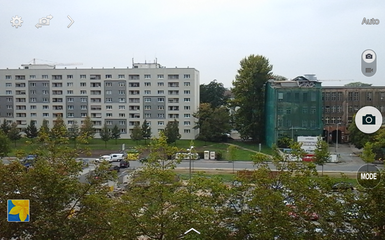
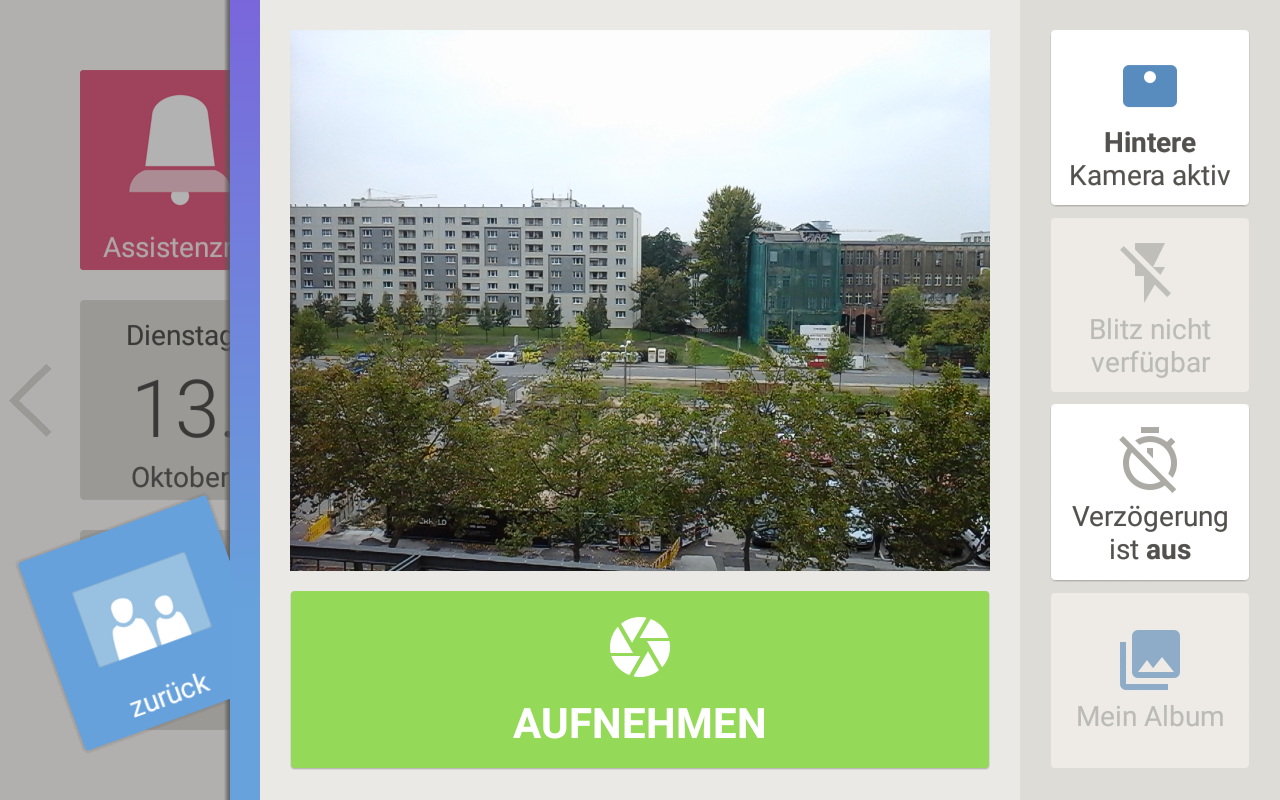
In this article we will first give some examples of design changes that can make a product better for almost every user. Next, we will describe changes that make a product better for seniors in particular and finally, we will give examples of trade-offs, i.e. changes that can make a product better for seniors but less desirable for other user groups. We will use a running example by comparing the general Android 5.0 tablet software with the senior-specific Asina tablet software.
Things that make a product better for (almost) every user
When your product, or user interface, conforms with general principles of user interface design, it is likely that almost every user will benefit. The user experience of well-designed products is often ‘invisible’ because the user-system interactions are natural to the user. When user-system interactions are not natural, users become less efficient, less effective and they become frustrated. Examples of common design failures are icons without labels and bad information architecture.
Add labels to icons
The problem with icons without labels is that most icons are hard to recognize and ambiguous. For example, the infamous hamburger icon can mean so much as ‘menu’, ‘list view’ or ‘drag to rearrange’. When users do not know what an icon stands for, they are less likely to click or touch it and less likely to find what they are looking for. Icons without labels are even more problematic on touch screens, where tooltips are non-existent.
Develop meaningful information architecture
The problem with bad information architecture is that people will either not find what they are looking for at all, they will need much longer to find it, or they will need much longer to decide that it is not there. The more difficult an information architecture is, the sooner users will abandon your product and go to the competition.

There are many other principles that can be applied to make a product better for (almost) every user. This article however focuses on those things that make a product better for seniors in particular. So, let’s continue.
Things that make a product better for seniors in particular
Improve functional aspects
Products that are meant for seniors and perceived to be useful for them by designers, caregivers and policy makers are sometimes not perceived to be useful by the seniors themselves. There are at least three possible reasons for this: (1) the product does not address a strong need, (2) the product does not address a frequent need, (3) the product stigmatizes.
The product must address a strong need
Although every senior has different needs, there are many known commonalities. Most seniors e.g. want to continue to live independently in their own homes and continue doing the things they did before. Useful products therefore address needs in areas such as safety, wellness, mobility, social connections and entertainment. To identify and understand these needs, designers and developers need to do user research with real end-users.
The product must address a frequent need
Imagine that you live in an area with a warm climate, such as southern Florida. Would you buy a down jacket, just in case it might get cold a few days per year? Probably not. You would simply put on an extra sweater or stay indoors. Many seniors look at your product in the same way: it might be useful one day, but will I benefit from it on a frequent basis? If not, it is probably not worth spending the money, nor the effort to learn how to use it (every time again).
The product must not stigmatize
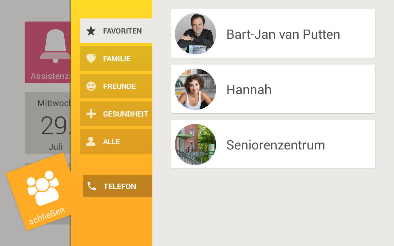
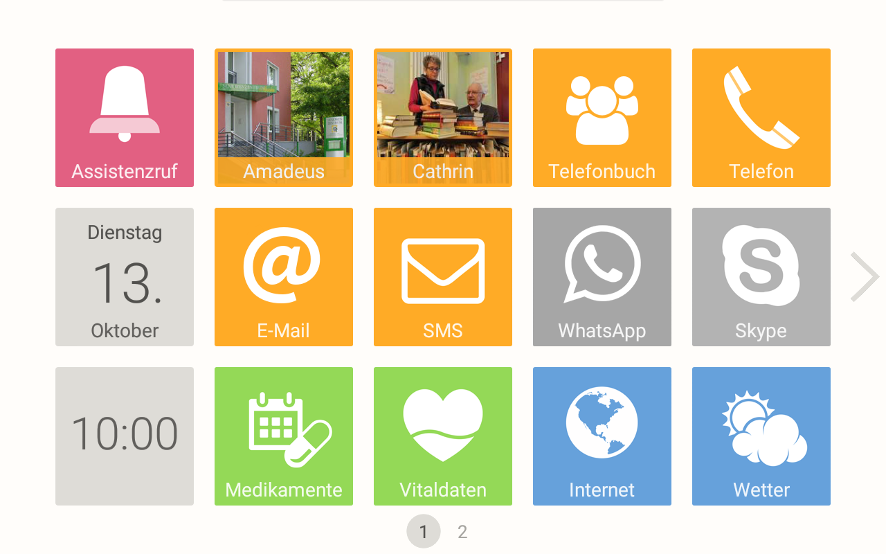
Products for seniors must emphasize their independence and well-being, rather than their dependence or frailty. Imagine that you develop a tablet for seniors. It may have useful functions such as an emergency call button, a medication reminder and an app to measure vital data. However, to make the product less stigmatizing, you might want to offer an app with the local public transportation’s timetable as well. Even when the majority of the tablet’s users no longer travel by public transportation, having the functionality may strengthen their feeling of independence.
Whereas tablets are extensible, other types of products may not be extended easily, such as wearable panic buttons. In such cases, designers should make the products non-obtrusive, beautiful and comfortable. Who wants to wear a hard and ugly piece of plastic around her neck or wrist every single day, which screams: “I am helpless!”?

Improve visual aspects
For an average human being, visual decline starts at the age of 40. It may become more difficult to focus on nearby objects – such as user interfaces – and the eye may become less sensitive to light. Products that use larger fonts and have a stronger contrast between foreground (text, buttons, menus, etc.) and the background will be easier to perceive for seniors. Because visual decline can differ enormously among people, products should allow the user to adapt fonts and contrasts by herself or by a caregiver. Other examples of visual aspects that can be optimized are motion, lay-out and colour.


Improve auditory aspects
When people grow older, their hearing capabilities decline in general and for higher pitched sounds in particular. Products should therefore use loud and clear tones across multiple frequency bands.
Improve motor aspects
Sooner or later, many seniors slowly lose their motor capabilities. Especially on mobile touch screens with small user interface controls and little to no haptic feedback, it can be extremely difficult for seniors to trigger the right actions. Holding a device, such as a tablet, for a longer period of time can also become a problem when the device is heavy, thin, or slippery.
Products must be designed with these issues in mind. User interface controls must be large, have sufficient spacing between them and should not be moving, e.g. a pull-down menu that collapses by itself too quickly.

Improve cognitive aspects
Aging can have many effects on a person’s cognitive functions, such as memory, attention, motivation and problem solving. Unfortunately, in most cases, these effects make seniors less efficient and effective at using interactive products than younger users. The good news is, that there are many things that developers can do about it. A good design for seniors for example presents little information at a time, clearly states where the user is in the information architecture and clearly shows what can or needs to be done.


Make it adaptable to the senior’s needs and context
There are major differences among seniors. For example, some have perfect sight, but below average motor abilities. Others have perfect motor abilities but diminishing sight. Moreover, seniors are not just different among each other; the needs of a single person will also vary over time. E.g. a senior may first become more adept at using a certain product and later become less adept when her psychophysical condition worsens. Needs may also change depending on the time of the year. In summer, many people like to be outside and want to spend less time using technology.
To account for the different needs among users and the changing needs of every single person, interactive products need to be adaptable. These are some examples of ways to adapt a product:
- Change font size, contrast, colours, motion;
- Add, remove, or hide apps/content;
- Activate, deactivate, or hide functions within apps/content.
Seniors and their (remote) caregivers should at least be allowed to make adaptations manually. But it can be difficult for people to make the right adaptations. Therefore it is sometimes better to make a product adapt automatically or semi-automatically (after approval from the user). This will be the topic of a future article.

Offer training and support
In general, seniors have a lower self-confidence when using interactive products. Providing analogue, digital, remote or in-person training can give seniors the necessary self-confidence to start using your product or one of its new functions. It can also reduce the number of errors made and thus reduce the need for providing support. Many seniors like training in groups, because it allows them to get in touch with more people and to learn from other people’s questions.
When seniors encounter problems while using an interactive product, they are almost twice as likely to give up on a task and will blame themselves 90% of the time, compared to 58% of younger users (Nielsen Norman Group, 2013). With good design, a large number of problems can be prevented from occurring. However, when all fails, there should be a way for the senior to get support.
Support functions can be integrated in the product, e.g. through context-sensitive tips, a list of frequently asked questions, how-to videos or a searchable knowledge base. However, in most cases, users who got stuck will either not be able to or will not want to use the product itself to get support. A better way to provide support is via a call centre or in-person in a shop or at home. Remote support staff should have the possibility to view the current state of the interactive product, e.g. through screen sharing. Even when seniors do not make use of the support services, the fact that support is available can increase the product’s perceived user experience.
Trade-offs: things that make a product better for seniors, but less desirable for others
Now we get to the tricky part. Some design changes that make a product better for seniors make it less desirable for other user groups. The good news is, that the positive effect on seniors is generally much higher than the negative effect on other user groups.
Large fonts
An example of a trade-off is the use of very large fonts. Whereas they may be perfect for an older user, they also take up valuable screen space, which will require users to scroll or swipe more. Younger users are often able to process more information at a time and would benefit from having this information available visually without having to scroll or swipe.

Guided procedures
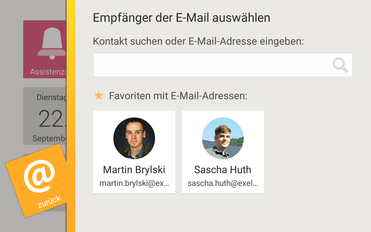
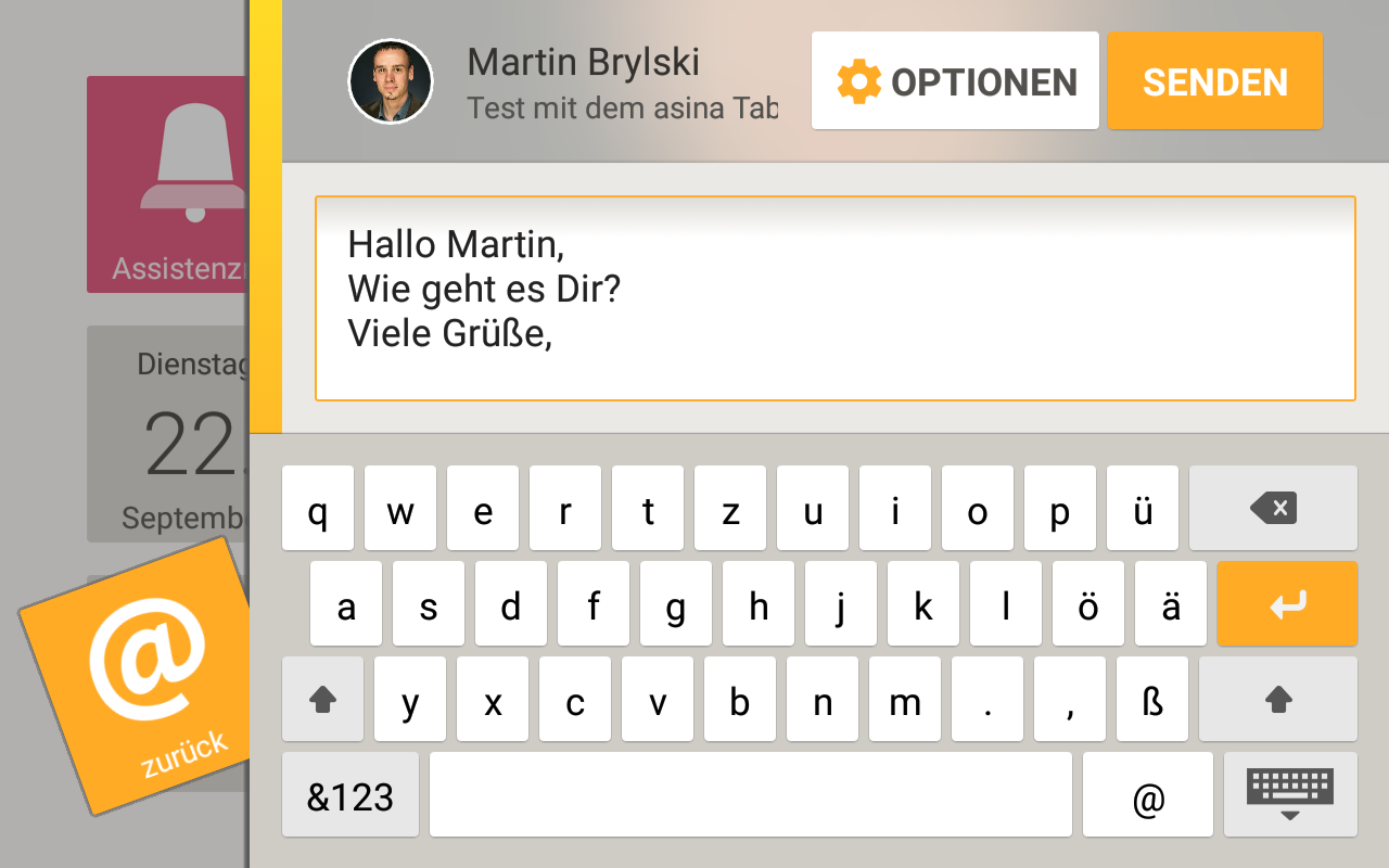
A second example of a trade-off is the use of guided procedures. A guided procedure breaks a complex task apart in manageable chunks. In each step, the system tells the user what needs to be done and mostly the order of the steps are fixed. It may be possible to go one step back, but it is generally not possible to skip forwards. This approach was e.g. applied to the design of the Asina e-mail application, where the user must first select a recipient, then enter the subject and finally write the message. For seniors, or other people who have little experience with your product, this approach generally improves the ease of use. However, for expert users or for (younger) users who can process more information at the same time, guided procedures are too rigid. They prefer to choose which steps to take and in which order.
Progressive disclosure
A third example of a trade-off is progressive disclosure. On one hand, when functions that are infrequently used by seniors are hidden behind a button called ‘more options’ or buried in a menu, this will decrease the cognitive load for them. But at the same time, it will increase the cognitive load for those who do want to use those functions. Therefore, good user experience researchers investigate which functions are used by whom and how often, to make informed decisions on how prominent those functions should be positioned in the user interface.
Conclusion
Some design changes can make a product better for almost everybody. Those are the best ones. Other design changes can make a product better for seniors in particular. Those must be implemented when a significant part of your (potential) users are seniors. Actually, it is quite likely that seniors will be significant for your business in the future (BCG, 2011). There are also design changes that benefit seniors, but are undesired for other user groups. User experience experts can make these trade-offs explicit and help you decide what has the best impact on your business.
Would you like to improve your interactive product’s user experience for seniors? Please contact us.